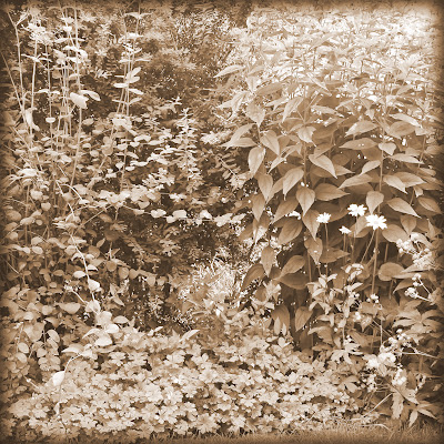
There is a first time for everything. Despite my antipathy towards garden designers I’d like to pass on a garden design tip.
Yes, for the first time Garden65 strays away from the minutiae of composting and the tedium of taxonomy, and faces up to the fact that at this tail end of the summer it is looking raggy and tired.
There is need for order in the borders.
The following advice doesn’t solve the problem overnight but I thought it was an interesting approach. A contributor on an American blog 'GardenRant’ (highly recommended) sent pictures of her garden to a landscape architect called Thomas Rainer. In his opinion contrast, in terms of colour and form, is the way to create the impression of depth and space in a small garden.
“He counsels discipline: “Don’t bring a plant into that garden unless it has a striking form (spiky, billowing, vertical spire), strong foliage color (blues/golds/purples, etc), or a long season of blooms (2 month minimum). In a small space, each plant must earn its keep. Expect more, get the perfect cultivar, and continue to adjust. Imagine the plant in your garden in black and white. Does it still read? Does it still contrast from its neighbor?”
While I mull that over I did the easy bit and took black and white photos of the great walls of plants that currently loom over the lawn. Of course, I couldn’t help tweaking them into a pastiche of old Fox Talbot images, but generally I think we can safely say contrast isn’t a primary design principle of Garden65.

